
Article
6 Things You Didn’t Know About Color Palettes for Print Ads
 Did you know that 82% of internet users trust print advertising when making a purchasing decision? Print is still king, having been found to be less annoying and more engaging than its digital counterparts. Combine that with the powerful effects of color palettes for print ads and you’ll find that conversions will spike.
Here are six things you didn’t know about color palettes for print ads.
Did you know that 82% of internet users trust print advertising when making a purchasing decision? Print is still king, having been found to be less annoying and more engaging than its digital counterparts. Combine that with the powerful effects of color palettes for print ads and you’ll find that conversions will spike.
Here are six things you didn’t know about color palettes for print ads.
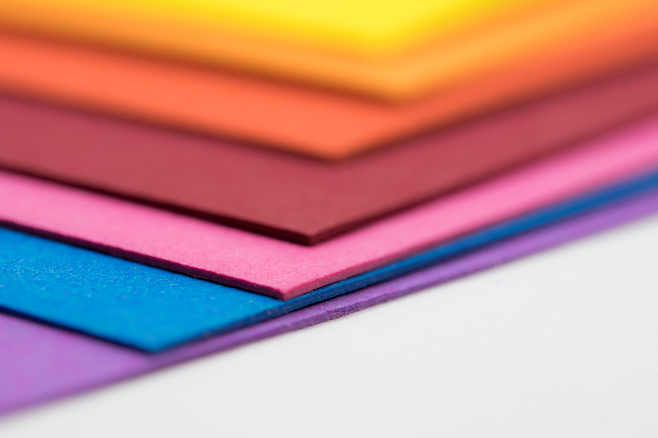
1. Researchers Have Noted Links Between Specific Colors and Behaviors
Color psychology is a widely used tactic by marketers and advertisers because colors help target emotions, which are what ultimately drive sales. You’re probably already familiar with the basics of color psychology, such as red representing urgency and white being the color of cleanliness. What is interesting to note, however, is how colors relate to shopping behaviors. For example, red, royal blue, black and orange are associated with impulse buyers. Bargain hunters, on the other hand, seek out teal and navy blue. Some of these less obvious color associations make more sense, like pink, sky blue and other soft colors connecting with traditionally minded shoppers. Similarly, brown makes us think of overripe, rotting fruits and veggies and shouldn’t be used to market produce.2. Color Meanings Vary by Culture
When you’re choosing a color palette for your print ads, you have to keep in mind the culture of the recipients. Color meanings vary on where you’re located in the world, so it’s important to consider where you plan to send your print ads. Let’s take green for example: the color has traditionally been forbidden in Indonesia, but in Mexico it’s a national color that stands for independence. The English phrase for jealousy is, “green with envy” but also represents wealth, nature and inexperience. In the Middle East, green represents fertility, luck, and wealth and is considered the traditional color of Islam. In Eastern cultures, green symbolizes youth, fertility, and new life, but it can also signal infidelity, as it does in China. This wide range of meanings can influence the effectiveness of print ads, so keep that color psychology in mind when choosing a color palette.3. An Eye-Catching Palette Isn’t Always Good
Another important consideration for color palettes is that the colors work naturally together and don’t catch the eye in a negative way. Some print ads still have troublesome elements like too-similar text and background colors or neon colors that irritate the eyes. Others use blocks of color to differentiate between elements of the ad, which are also difficult to process. Generally, it’s a good idea to have contrast between text and background colors for easy readability and a color palette that makes sense with your product. The idea is to catch the eye and be memorable—for the right reasons.4. The Most Memorable Palettes Are Based on Two Colors
When you think of a two-color design, it’s almost a reflex to think of a company’s logo. McDonald’s uses yellow and red, Starbucks uses green and white, IKEA uses blue and yellow, and the list goes on. This means your print ads will be memorable if you stick to using two colors for your base and use complementary colors to tell the full story.5. The Same Color Palette Won’t Work for Everyone
This was mentioned earlier, but your print ad’s color palette should reflect your brand in a positive light and be relevant to what’s being sold. Just as produce sellers should stay away from brown and instead pick vibrant colors, dessert artists should stay away from earthy tones and lean toward pastels; as that’s what matches people’s expectations. Another example: red is what comes to mind for sales because it’s all about action and doing things right away. However, it’s an aggressive color, and your customers may need to be in a calmer state of mind before making purchases. Context is key.6. Color Print Ads Are More Trustworthy than Digital Ads
Two eMarketer.com studies found that print ads and marketing materials had a much higher trust rate at 54% than digital advertising, coming in at a mere 16% trust rate. The studies were conducted in Germany and the US with consistent results, showing an overall preference for print ads. Printers are equipped to provide you with a wide range of colors for your ad’s color palette, and you can rest easy knowing that you’ll gain more trust (and sales) with print ads than with any digital marketing. When drafting a print ad, consider the color palettes you are using for maximum effect. At the end of the day, for every 100 people you send this carefully crafted message to, about 4.4% are going to convert into sales. So, keep that in mind when you’re assessing your next marketing spend this year.Now that you understand just how important choosing the right color palettes are to the end design of your next printed project, it’s time to start thinking about what comes next. At cdsPRINT (Corporate Document Solutions), we’re here for all your design and printing needs. Our expert graphic designers can help you choose the right colors to make your next design project stand out. Reach out with any questions! Call us at: 888.601.3086.
Comments Closed.